
September 2019 Creativity Challenge
4, 3, 2... 1
4 Beads, 3 Shapes, 2 Colors... 1 Prize

Congratulations to Marta Bernbaum!
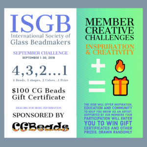
Thank you to our sponsor!
Artist Statement
I grew up in Belfast, Maine, and received a BFA from The Massachusetts College of Art in Boston in 2000. It was here that I studied a multitude of disciplines involving glass as a medium.
Torch work, which was not covered at Mass Art, had certain qualities that were desirable for the creations that I had dreamed of making.
Immediately following graduation I spent the summer beginning to learn, from instructors Sally Prasch and Robert Mickelsen, the torch working techniques that I employ today.
My floral visions investigating adaptation, that had not until then been able to be produced with the detail and delicacy I had so desired, were on their way to being realized. I currently spend most of my time behind the torch instructing others about this process that, after eighteen years, still creates much joy and wonder for me.
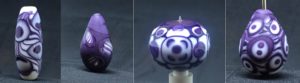
This is my first time entering an ISGB challenge. I have fallen head over heels for silver plum, I made my first few beads with Ivory and silver plum but decided that the reactions were too much.
So I started again with white and silver plum. I played with bending the colors and disrupting patterns we all know and love. I of course wondered does clear count as a color?
(always a trouble maker) with the last bead I created windows for the pattern with clear, and filled in around them to block the reminder out. I have also been playing with egg shapes.
Making an egg that is pleasing is incredibly difficult there are inherent proportions that have to be conveyed to be appreciated. Unfortunately the egg shape for the window is not ideal but I was too afraid to close the windows. I learned that I have to give myself more time to do this it is of course coming in last minute.
Artist Statement
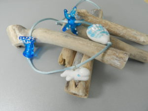
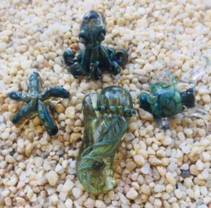
My workstation is always full of colored rods ready for my imaginative and creative juices. So, when I was challenged with 2 colors I looked to nature, who better can show us the possibilities than Mother Earth. The ocean has always brought me peace and calm with its sounds and beauty of endless combinations of colors and marine life. I choose white and Elektra blue to create my Ocean beads collection. For my shapes I chose a starfish, shell, a wave, and the beluga whale. Glass, gravity, fire, scissors, tweezers, a small knife, and graphite/brass paddle tools brought them to life. This challenge pushed me to think more like an artist, to create a cohesive collection that conveys a message and displays beauty in the simple things using a small amount of color and tools. I enjoyed moving the glass in a playful manner to create the majestic objects and shapes I was looking for.
Artist Statement
Artist Statement
I found that this challenge was so fun....very open ended...gave the artist something to think about....it reminded me of many of the assignments that I would give to my high school art students. It was good to have some parameters but still have room to develop an individual artistic representation in glass.
Thank you for the challenge.
Artist Statement
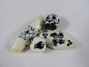
As soon as I heard about this challenge, I knew I was going to use black and ivory as my 2 colors. The contrast of these colors really highlights the precise application of décor: simple dots and raking in this case. There is so much you can do with a dot! I have been experimenting with various masking patterns, so that was a logical choice, once I picked the color. Of course, I am obsessed with birds, so they had to be included. I really enjoyed this project and made several other shapes and designs as well. I chose these four for the variety of shapes and masking patterns. Now I am looking forward to the October challenge. Keep 'em coming!
Artist Statement
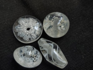
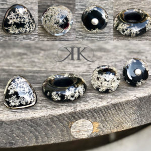
I have chosen two types of glass - black and transparent - to create two colors: black and silver bubbles that result from brass sublimation. When creating my beads I focuse on making unique peaces which can be worn as solitaires. I have chosen two shapes to be worn as rings (a flat bead with a hole and a triangle flat one with a screw) and two shapes to be worn as solitaire pendants - one big hole bead and one donut. The challenge was: how to create a glamorous bead for my customers, using minimum colors.
Best regards
Artist Statement
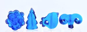
The September Challenge to choose two colors and use them to make and decorate beads of various shapes and sizes was an invitation to play. My approach was to choose the two colors and just have fun. I decided that I wanted to use transparent colors with an emphasis of the darker transparent to primarily work like a border to the lighter color, so I used aqua and ink blue glass by Effetre.
I wanted to experiment a bit. In the first bead on the left, I layered the glass to see what light looked like with the bordered layers. (to me, it was great to see, but convinced me that this technique didn't appeal to my aesthetic. It didn't look clean enough as a single layer of glass did.) The second bead (simple tree), I wanted to use the border and change the shape once it was applied to see how it looked. I would do that again. The third bead (bird with hole) was an experiment to see what it would be like to make the shape and also whether I could make a hole (to possibly dangle something in jewelry) and have the hole with the second color as a border around it. It worked, but I would create it in a different way next time. The fourth bead was to see whether stretching then tightly curving the glass would make a difference. It reminded me of rams' horns or an architectural piece. Short answer: yes it does, but it's a matter of heat control. I will try this again but in different combinations of the two colors to attempt additional results.
What a fun excuse to play with glass and make some beads I hadn't before. Thank you for this challenge.
Artist Statement
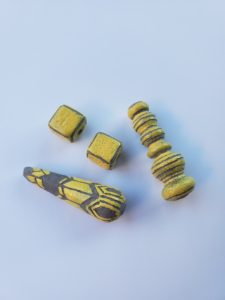
I recently started carving beads after an inspirational class this past summer with Holly Cooper, and so for this challenge I decided to incorporate carved design to enhance shape. I chose grey glass with yellow enamel to highlight contrast. In considering shape, I went with a drop shape because that provides a lot of surface to carve. I have an unusual heavy brass lamp that could double as a weapon in any martial art movie, and I thought it would be a challenge to recreate it in glass. And as it’s nearly impossible to get glass into a cube shape, I was curious if I could make beads close to a cube shape, and enhance their corners with a carved design. I really enjoyed this challenge!
Artist Statement
This challenge correspond to another one I am doing as part of the Facebook group 'Limited Pallet Challenge'. We are using Thai Orchid, Opal Yellow, Emerald Green, Hades, and White for the month, so I picked two of those to do the ISGB creativity challenge. My favorite thing to make are hollow beads. I decided to try out making some of the basic bead shapes we all start out with making solid beads with on hollow beads instead. The dot one is the normal doughnut shape that most of my hollows end up with. Next I did the square one, squares are always more challenging in hollows because as you flatten the sides you have to keep blowing them out to keep them from becoming concave. The same is true with the lentil shape, and I think this one is my favorite. The last one is more of an egg shape and it started small so the stringer really stretched out and I love that look.
The challenge was fun, hope that we keep doing them!
Artist Statement
I used Ivory EFF 264 and EFF 036 Aqua. One of my favourite colours. I live on an island and these colours represent the sand and sea.
Next challenge was thinking of shapes... but there I would have loved to have more time to come up with lots more shapes. But the greatest challenge was making animal shapes with only 2 colours.
I am so looking forward to the next challenge. I love it when my customers make requests to push me out of my comfort zone. I can usually hardly wait to get to my torch.
What I learned... to limit myself sometimes, having fewer choices to come up with something new. Also how wide the colour shade ranges when working with only two colours and one being transparent.
Artist Statement
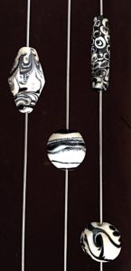
For this learning experience, I used Effetre light Ivory and Transparent Black. I wanted to get away from the traditional silver foil / ivory / intense black and see what I could do with a simple basic black and white. I learned that with enough heat, even transparent black will web and shadow on the ivory. I am showing 4 beads, and at least 3 different shapes, (lentil, barrel, round hollow, and also a bi-cone), using 2 colors, and the reactions I got with varying applications of heat to the bead. The barrel with stacked dots are crisp and defined separation of colors, the lentil is showing the effects of more applied heat and the beginnings of webbing, the round/hollow is showing definite webbing and the beginnings of shadowing, with the bi-cone showing webbing and definite shadowing after heating (technical term coming up) “the snot out of it”. I used a Nortel Mega Minor with 2 5lpm OxyCons for this experience. All beads were hand shaped using only a marver and were annealed directly from the flame in a digital kiln, and learning definitely took place.
Artist Statement
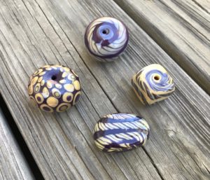
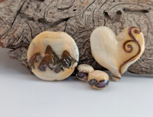
Colors: Dark Ivory and Test color Double Helix OSLT.
I struggled with color choice. I wanted to maximize the results with reaction and I intended to use Dark multi color or Raku, but when I sat down at the torch, the rich gold just felt like the color of Fall and the reaction would represent the changing colors of the season.
Shapes:
Straight sided Lentil; I always love this shape for designing a story, and I intended to work with the concept of trees and fall, but then a mountain appeared. I often sit at the torch with one vision and create something entirely different, letting the glass or my subconscious lead the way.
The Heart represents my love of the Mountains and I am always practicing stringer with a love of metal work and scrolls.
Two small Rounds; a pair of earrings of course.
Thanks for letting me play!
Artist Statement
Artist Statement
After reading the terms of the contest, I started thinking - what two colors would I use? Contrasting colors or restrained soft tones? How will they look in different forms and under different lighting?
Good challenge! I immediately dismissed all the glass that needs a transparent coat - as “transparent” is also a color!
I thought about silver-containing glass, but it can produce many shades, which would violate the two-color requirement. Hence, I decided that colors should be simple, and therefore contrasting.
In addition to color, I thought I could also take advantage of the contrast between transparent and matte glass for an added effect.
Additionally, the glass must be able to form different shapes, as indicated by the requirements of the competition to create at least three different shapes.
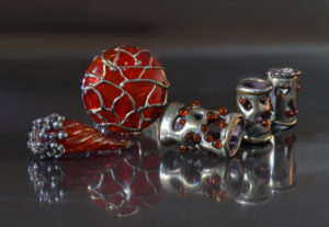
As a result, I opted for the Effetre Transparent 076 Red (a transparent bright glass) and Effetre Pastel 275M Silver Plum (a soft matte dark glass).
I chose different shapes for the beads to highlight the contrast of these two glasses. These two glasses provide endless opportunities for creativity.
As a result, participating in this competition led me to create several beads that are somewhat unusual for my style.
Thank you for a great challenge!
Creativity Challenges
September Entries


