
January 2020 Creativity Challenge
2020 Pantone Color of the Year

Congratulations to Stephanie White!
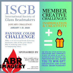
Thank you to our sponsor! ![]()
Artist Statement
Hello Everyone
I have been working the glass world for 7 years now, but more than an intensive part- time job.
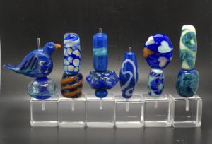
It's very nice that Pantone has brought Classic Blue to trend color 2020 because it is also one of my favorite colors. It is timeless and very suitable for many occasions.
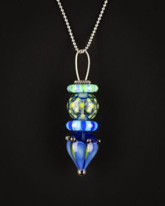
With my pearls combination I would like to represent some of many artistic
variants that this color can be made with. Sometimes dominant and sterile (Classic Blue with Dichroic Glass and Silver Glass) in the foreground or in the background and playful (with Silver). Despite the differences, I would like to represent the unity and the beauty with my creation that is my aim when I am creating a chain.
Warm pearly greetings and Happy 2020
From
Angelika Beele
Entry
Artist Statement
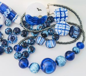
For me, the color challenge turned into a collaboration with my friend, Diane Rogers. The challenge was the starting point for us both to create a collection of colors (within the Pantone palette) and shapes of beads and headpins, and then collaborate to pull it all together into a fun, festive and exciting necklace. We have spent a lot of time together over the past year sharing our mutual interest in learning to grow with our bead making, and have lots of fun doing it. I believe that this finished piece showcases the best of both Ivy and Diane, and we definitely enjoyed participating in this challenge. Now we have to decide who gets to wear it first!
Entry
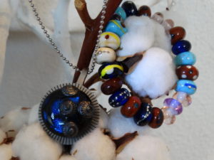
Artist Statement
Color has fascinated me for as long as I can remember. The way it can influence one’s sense of well-being intrigues me as does the way color combinations can appear beautiful or dangerous, appealing or appalling, edible or poisonous. Petals, wings, or eggs - the color combination, inspired by this year’s Pantone of blue and orange, I used to create this visual narrative suggests an eco-system that looks to beauty in procreation. All beads are hollow and handblown.
Entry
Artist Statement
I cherish the opportunities that the ISGB provides its members to stretch their creative muscles. Since 2009 I have enjoyed a number of projects for ISGB exhibitions that help me to grow in various ways. These exercises help me to think about my skills differently when collaborating with another artist who works in a different medium, to learn to use new media myself, and to explore various themes in depth.
For this challenge I made a totem pendant in cool shades of green and blue, using Pantone’s Classic Blue, Lime Punch, Provence, and Jasmine Green together in one piece. Not one for complementary color schemes, I often combine several shades of the same color in my work and find this approach to sometimes test the limits of my comfort, as well as help me to discover new pairings.
Thanks to the ISGB for offering members a chance to grow!
Entry
Artist Statement
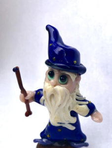
I made a wizard! I do love the Classic Blue, but most of the other colors weren't ones I would normally choose to use. So I debated ideas for awhile and thought that a wizard's robes could work well for the primary color and I could use bits of the other colors for the rest. Sunlight turned into a mustache and beard, Coral pink was the skin color, while bright Biscay Green eyes made me smile when choosing that color. The wizard has Saffron dots on his hat and robe to signify stars. His wand is made from Cinnamon Stick brown with a Grape Compote jewel on top. His boots match the jewel (Wizards like to accessorize, who knew?) I believe there is a dragon beyond what you see in the photo. He will be my next bead in the kiln. This was fun, thank you!
Entry
Artist Statement
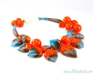
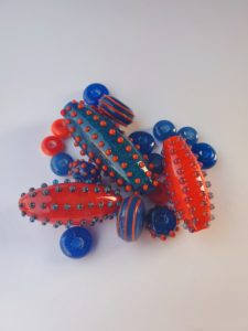
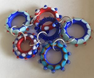
I love wearing navy blue with orange accent jewelry pieces. I decided to create beads that I will turn into a necklace piece for myself. To compliment classic blue, I picked faded denim and orange peel. The closest matching colors I had on my shelf were Keto by Double Helix, Tardis by CiM, and Effetre orange special.
Entry
Artist Statement
I have to admit that I am very excited about the Pantone color of the year. I think the specific hue of blue that was chosen is exactly how they describe it: classic. It is not overbearing, but complimentary, it's not dull, or bright, but somehow both at the same time - it's the perfect blue. I chose to mix it with mustard, ivory, and clear. I chose clear so that I could play with depth and encasing colors, and honestly the mustard and ivory bring out the best in the blue and compliment it well, but I have to admit that I chose them based on the colors that I had available to me. I have had a long and slow introduction to lampwork; my mom is a lampwork artist and I've dabbled in it through the years, but was immediately more drawn to boro once I got my hands on it, and once I had the space, I set up my own home studio. In recent years, I have been gravitating more and more towards soft glass and have been "borrowing" handfuls of colors to try that are 104 and 90 when visiting my mom.
These beads are made with Bullseye rods. I approached this challenge with the intent to use some of the tools I have, but am not quite comfortable with yet - have a couple graphite rollers and a brass press that I'm learning to shape with, and as I move away from strictly working with boro to learn how other glasses work in the flame, I'm learning about how colors mix and meld differently depending on the COE, how layering and encasing can change the whole look of the bead, how to make my own stringers, and how to work on stringer control and consistency in my dot sizes! These were fun practice, and I can already tell that the big ivory dot bead is my favorite, and the encased colors with dots on the clear are runner ups. I used all of each color rod making these, so I'll have to try some more big bold dotted beads in other colors next.
Thank you for the opportunity to submit my beads, and for offering this fun creative challenge each month! I'm excited to keep doing them and honing my skills.
Entry
Artist Statement
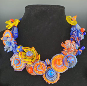
I just picked up the chart colors from my stash and set my inner painter free without any direction.
Entry
Artist Statement
To me, Classic Blue is eloquent in its simplicity. I reviewed all the color combinations that were suggested, and I was drawn to keeping blue as the focus. The other combinations seem to take away from the classic feel. Since blue reminds me of home on Cape Cod and my Mom (her favorite color), I used this as my starting point. First was plain blue hollows and solid beads, adding simple frosted beads to make my mom a necklace. Next, I thought stripes, and this led to tackling plaids. A real challenge - I never thought of making plaid beads before, but now I am working on ideas in my head. They need work, but I think this will be a fun idea to play with in the future. I am always drawn to creating pictures in my work - blue is obviously the ocean, leading to the blue waves and swirls. I used Effetre Cobalt for the blue, white, periwinkle and the frit was Val Cox's silver lake.
Entry
Artist Statement
To represent the Pantone Colors of the Year, I chose light and dark Periwinkle for the blue. Then, I used Kryptonite to represent the Biscay Green. This is a combination I would not have normally used, but was very happy with the results.
Entry
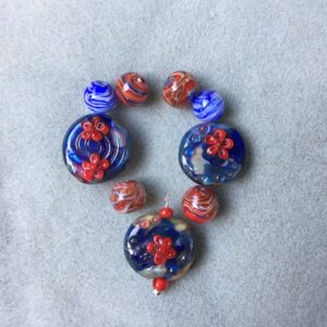
Artist Statement
The flower beads were made in layers of clear, white, hyperion, and shards of a dark cobalt and goldstone ribbon. The flame scarlet flowers were light red and candy apple. The round beads are encased beads made using wigwags. I took a class from Madeline Bunyan and learned many techniques, including wigwags, the flowers and using goldstone ribbon to make shards. The flowers took hours of practice before I was happy with them.
Entry
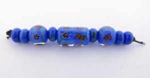
Artist Statement
For these beads I used an opaque lapis blue as a background with a sprinkle of enamel powder similar to faded denim. The butterflies are a light brown close to the cinnamon stick color and the flowers are a deep purple inspired by the grape compote color. I enjoyed the challenge of finding new color combos. Sometimes I get in a pattern in which I only use the same colors over and over, it was challenging and fun to break that pattern for this challenge.
Entry
Artist Statement
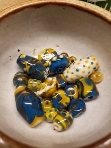
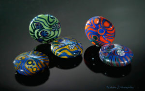
My name is Natalie Zhitomyrsky, I live and work in Tel Aviv. After seeing the terms of the challenge I carefully examined the suggested color options. It turned out that this combination of colors complement each other absolutely beautifully. Size of one bead was not enough, so I had to make several of them. I want to see how blue looks on different backgrounds. Visually, colors being nearby to it greatly change the shade. I bring to your attention a photo with the result of the work.
Entry
Creativity Challenges
January Entries


